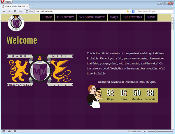
The latest work that I’ve been putting my creative energies in has to be the wedding website for my beautiful fiancée and myself. MarkandMari.com has been live since late July and it has been a labour of love and an adventure in responsive design.
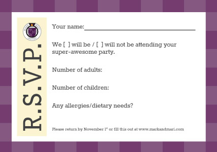
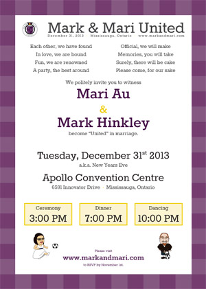
We wanted a website to reflect our personalities: cute, fun, engaging, entertaining, funny, creative, different and dynamic (well, she is). The colour scheme is built around Mari’s favourite colour, purple, which is the colour that the bridesmaids are going to wear. From there, a secondary palette was built. The soccer theme is my nerdity in full swing. When it is all done, the collateral will involve two soccer badges (logos) the website, invitations, RSVP cards, thank you cards, items for the banquet hall and customized soccer jerseys.
The learning curve in a responsive design is a tremendous one, and once I get around to making a blog for this site, I will be sure to explain my follies and hope to provide insight to anyone looking to try their hand at this. Responsive design just means making a webpage/website that responds to the width of the viewport of your browser. In lesser geek speak, it means it’s one web page that appears differently from your desktop to your iPad to your Android Galaxy S3.
I’ll post the jerseys once they come in. They’re gonna be awesome. (I’m biased, to be fair)


